Set Field as Read-Only
Before any of this styling can be applied, we first need to actually set the field as read-only. You can do this with Javascript (like so) or you can use our GP Read Only plugin which let’s you set all applicable fields as read-only with the click of a button.
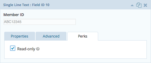 GP Read Only Settings
Targeting Desired Fields
You can style most field types with the the following CSS selector. Drop down, Checkboxes and Radio Button fields require slightly different selectors.
Most Fields
View this code snippet on GitHub.Drop Downs
View this code snippet on GitHub.Checkboxes & Radio Buttons
View this code snippet on GitHub.Checkbox & Radio Button Labels
View this code snippet on GitHub.Textareas
View this code snippet on GitHub.
Styling the Fields
These examples are based on the Most Fields example above. Just change the selector to apply them to Drop Downs, Checkboxes or Radio Buttons. These styles would go in your theme’s style.css file.
Change Font Color
Make the field value appear to be grayed out.
Change the Cursor
Change the cursor to indicate that the field is not editable.
Hide the “Input”
Give the appearance that the text is not actually being displayed within an input. View the demo for a visual example.
Combining Multiple Styles
View this code snippet on GitHub.